


PROTECT YOUR SKIN, PROTECT THE CORALS
A culturally grounded digital campaign for KOSÉ Malaysia that repositioned the brand's Japanese heritage while introducing reef-safe UV protection to Muslim consumers during Raya season.
ROLE
Art Director
DURATION
Seasonal campaign (Raya 2023)
PLATFORM
Digital-first (Microsite, AR Filter, Paid & Social)
REGION
MALAYSIA
Before consumers could judge the product, they had already formed an impression of the brand.
OBJECTIVE & CHALLENGES
Build brand trust and drive product consideration during the competitive festive season
Cultural Perception Barriers
Address misconception that KOSÉ is Chinese-owned, easing halal concerns for Muslim consumers.
Category Education & Differentiation
Promote reef-safe skincare education with emotionally resonant messaging.
Audience Engagement Strategy
Boost festive social engagement for segmented audiences: 25–35 (awareness) and 35+ (conversion).
FINDINGS
Sekkisei's packaging is branded in kanji. Client research found Malaysian consumers unfamiliar with Japanese script often misread it as Chinese.
The misread triggers a safety doubt (fading, as C-beauty rises in popularity) and a permissibility doubt (halal concern, while unrelated to quality, still doesn't resolve on its own).
Malaysia's audience isn't one cultural group. Malay, Chinese, and Indian consumers all shop this category, and English alone doesn't reach all of them equally.
The campaign ran through Ramadan into Raya, the peak shopping window for Muslim consumers. An unresolved trust doubt here doesn't just cost a sale, it costs the highest-value sale of the year.
WHY THIS MATTERS?
KOSÉ is a Japanese brand, but its flagship skincare line, 雪肌精 (Sekkisei), is branded almost entirely in kanji. For many Malaysian consumers unfamiliar with Japanese scripts, the packaging was often mistaken for Chinese. That perception came with baggage.
For some consumers, it revived memories of a time when certain Chinese-made beauty products were associated with safety concerns and inconsistent quality. For some Muslim consumers, it also raised questions about halal suitability. As KOSÉ expanded into the Muslim market, those assumptions became a growing obstacle.
The challenge wasn't the product. It was what consumers thought the brand was before they ever tried it.
KEY INSIGHTS
The doubt forms in the five seconds before anyone reads an ingredient list. Explaining the misread would only keep attention on it. Belonging first, explanation second, was the faster fix, and belonging had to work across language as well as culture, not just one or the other.
STRATEGY
One device, several jobs
Coral rendered in a batik-inspired motif, framed under a mosque-style arch with a moon overhead. This single visual carries both cultural relevance and UV/reef-safe product education. One visual language, not two competing ones.
Timed to the season, not just the audience
The moon in the device isn't decorative, it's the same crescent Malaysians watch for to confirm Raya's date. Running the campaign through this window put the brand inside a moment consumers were already emotionally primed for, not competing for separate attention.
Bilingual as reach, not just translation
Copy runs in Bahasa Malaysia and English, speaking to Malay, Chinese, and Indian audiences at once — accessibility as its own form of relevance.
Heritage second
Once the visual earns trust, copy reveals the brand's actual Japanese heritage — a quality signal delivered on the campaign's terms, after the doubt has already lost its grip.
CREATIVE APPROACH & ART DIRECTION
ONE MOTIF ACROSS ALL ASSETS

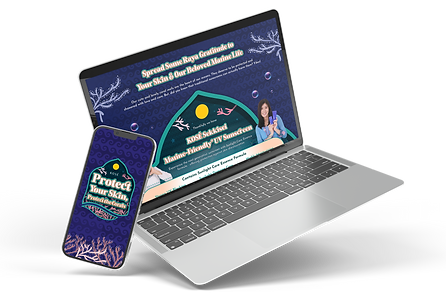
Batik-pattern coral, mosque-arch frame, moon overhead, the same visuals across masthead, microsite, and mobile.
WHY IT WORKS

Moon
Associated with Raya and it's significance
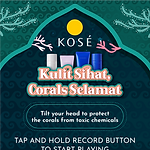
Arch
Signals cultural motif that relates to Malays

Corals
Corals redesign with batik patternd
Every element earns familiarity before the product is introduced, blending coral conservation with Raya values of family, togetherness, and mindful living.
AUDIENCE-FOCUSED COMMUNICATION
Leveraging Malaysian's bilingual capabilities, where we use both Bahasa Malaysia and English, reaching Malay, Chinese, and Indian consumers in one campaign.
Japanese heritage, with the focus on craftsmanship, care, and environmental respect, are introduced in copy after the visual has caught the audience's attention.
MY ROLE
My first end-to-end campaign at this scope. Worked under our Creative Lead.
Owned end-to-end:
-
Cultural sequencing strategy, relevance before heritage
-
Art direction across all assets, and execution for landing page, Key Visuals and AR Filter design
-
Directed coral-batik-arch-moon device across every touchpoin

CAMPAIGN SHOWCASE
CAMPAIGN LANDING PAGE
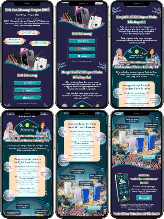
he microsite brought visitors into the coral world first, with reef-inspired motion, batik textures and mosque-inspired arches, before introducing product benefits. Familiarity came before education. Based on engagement data, the contest and AR filter were moved higher up the page during the campaign.
Visual Direction
Coral motifs, batik textures and arch design, with Japanese motifs in the background.
Mobile-First & Bilingual
Every section was designed for mobile, with Bahasa Malaysia and English presented side by side.
Interactive Storytelling
The contest and AR filter were built into the user journey, not treated as separate add-ons.


AR FILTER GAME & GIVEAWAY ACTIVATION
Instagram activity peaks during Raya, so the AR filter was designed for that moment. It turned reef-safe education into a simple, shareable game when audiences were already highly active on the platform.
Gamified Education
Collect good ingredients, avoid harmful chemicals.
Reward-Driven Engagement
Purchase-and-win mechanic encouraged sharing during Raya.
Seamless Discovery
Accessible via QR codes, social posts and influencer content.


SOCIAL CONTENT AND PERFORMANCE MARKETING
Adapting culturally intelligent multi-platform strategy with Instagram-focused execution maintaining visual consistency while adapting for platform behaviors during peak festive engagement.
Visual Consistency
A unified look across ads, the microsite and influencer content.
Influencer Strategy
Reef-safe messaging placed within relevant Raya content.
Platform Timing
Content launched around peak Ramadan and Raya periods.


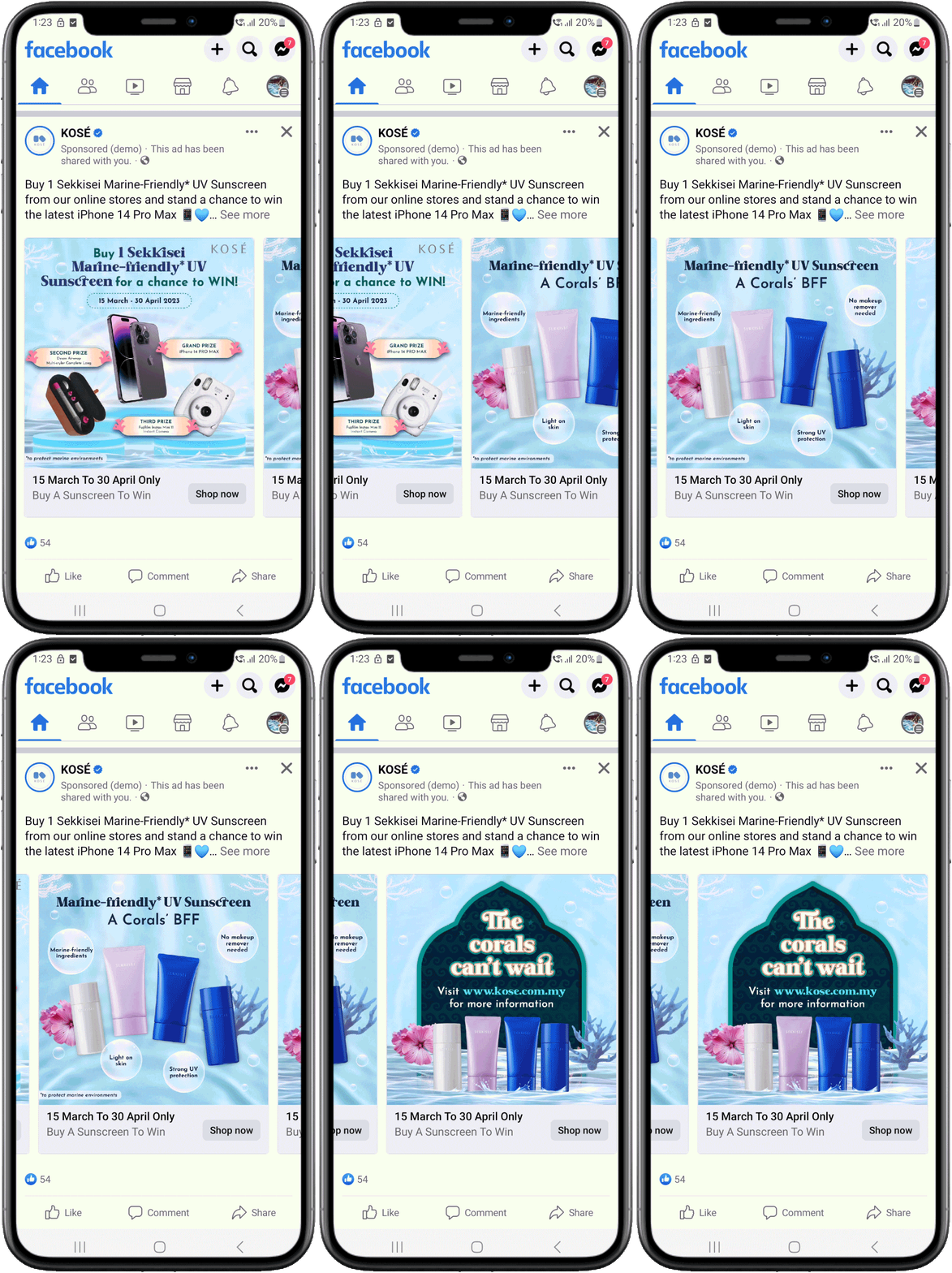


Achieved performance marketing efficiency, maximized ROI, and optimized audience engagement.
CAMPAIGN RESULTS
40%
Improve in CPC
(Cost-per-click)
57%
Improve in CPM
(Cost-per-1000-impression)
150%
ROI achieved
from campaign ROI targets

Designing Cultural Connection Across Every Touchpoint
This campaign prompted us to shift our approach from traditional skincare marketing to one that leads with cultural connection. Blending Japanese minimalism with Malaysian motifs required restraint and constant checks to ensure the work felt respectful rather than decorative.
Performance data also informed creative decisions in real-time. Early results showed lower interaction with the AR filter when it sat lower on the page, so we repositioned it higher in the journey, which immediately improved engagement.
The biggest takeaway for me was that in trust-sensitive markets, relevance and cultural understanding matter more than technical detail. That insight has since shaped how I approach campaign strategy and creative prioritisation.
CREDITS
Creative Direction & Quality Management Carmen Tan | Experience Design Lead Carmen Tan | AR Concept & Visual Design Carmen Tan | Campaign Execution Partners Krystyn Chew (AR Development), Nik Nayly (Content), Izzy Yong (Creative & Design Support), Farhana (Design), Irfan (Video)


![Physiogel Microsite Mainpage Design-Desktop [Recovered]-03.png](https://static.wixstatic.com/media/a969ed_720ef930042f42029b57e67aee491f91~mv2.png/v1/crop/x_156,y_0,w_814,h_814/fill/w_160,h_160,al_c,q_85,usm_0.66_1.00_0.01,enc_avif,quality_auto/Physiogel%20Microsite%20Mainpage%20Design-Desktop%20%5BRecovered%5D-03.png)